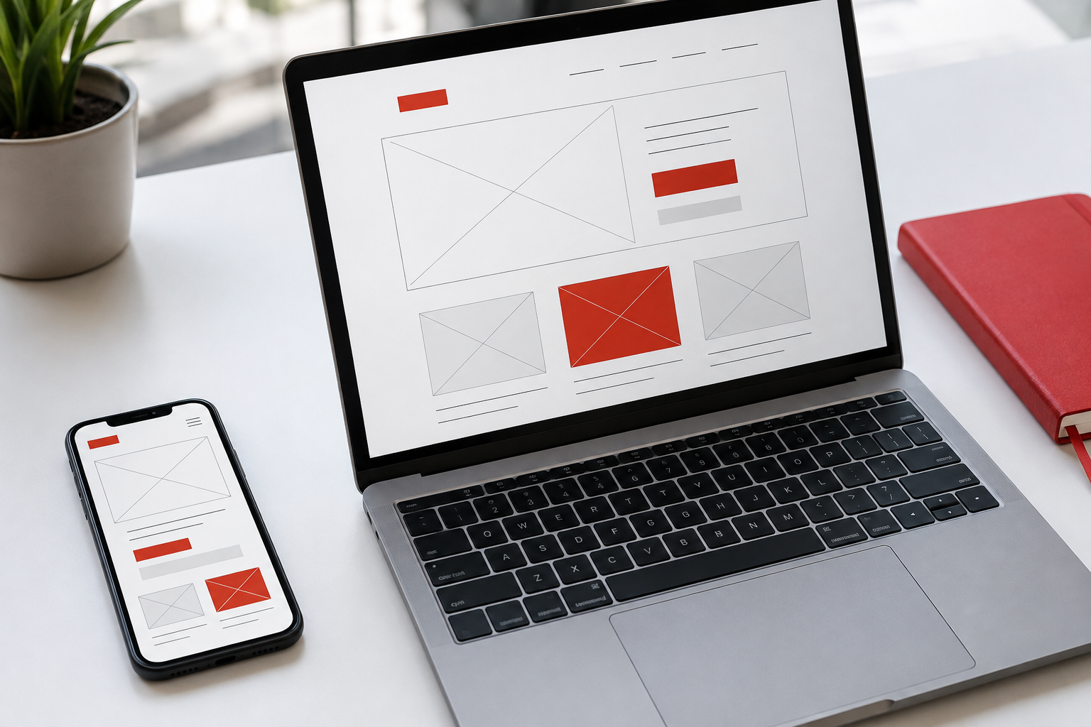
Start with one goal
Before choosing colors or fonts, decide what visitors need to do. Do they want to see your work, understand a service, or contact you? This goal provides the foundation for the page.
For a portfolio, the opening section should explain who you are and what you do. Follow it with examples of your work and a clear way to get in touch. Each section should answer the visitor's next question.
Give each piece of information a place
Headings help people scan a page. Paragraphs provide context, while buttons offer actions. When everything is large and bold, these three roles become hard to distinguish.
Use a restrained range of sizes and weights. Leave more space between groups of information than within each group. This makes the connection between a heading and its explanation immediately clear.
Check the content, not just the screen width
A responsive website does more than shrink a desktop layout. Five columns may need to become two on a tablet and one on a phone.
Check the longest headings, contact buttons, and paragraphs using real content. Make sure text remains readable and decoration does not cover important actions. Test navigation between sections as well.
Finish with a clear next step
Use button labels that describe the result, such as View project or Contact via WhatsApp. Visitors should not have to guess where a link will take them.
A simple design does not mean an empty one. It means every element has a reason to be there and helps visitors accomplish their goal.